
A school logo serves a specific purpose: it distills an institution’s educational identity and promise to families into a single mark. Its role goes beyond decoration. The logo appears on the school website, administrative documents, signage, uniforms and social media.
Every use builds—or undermines—perceptions of trustworthiness. Designing a school logo that inspires confidence means mastering a few graphic design principles, but also understanding what families consciously or unconsciously read into a visual identity.
Contrast and legibility in a school logo: what the standards actually require
Most school logo design guides discuss colors and fonts without addressing technical legibility. Yet it’s worth taking a closer look, because a logo that’s hard to read at small sizes or against a colored background loses its usefulness.
WCAG exempts text that is part of a logo from minimum contrast requirements. This exemption is often misunderstood: it doesn’t mean that logo legibility is unimportant. It simply means that the logo itself is not subject to the 4.5:1 contrast ratio required for regular text.
However, as soon as the logo’s colors are reused for buttons, links or headings on the school website, the contrast ratio becomes mandatory again. A school that chooses light blue as its brand color will need to provide a darker version for digital materials. Designing modern, reassuring school logos therefore means thinking of the palette as a system, not as a single color.
In France, RGAA applies to public institutions and certain private organizations connected to public services. The European Accessibility Act, in force since June 2025, extends these requirements. For a school, this means its visual identity must work across all its materials, including digital ones.
Testing the logo in monochrome, at reduced sizes (favicon, badge, embroidery) and against both light and dark backgrounds remains the best design precaution. A logo that only works in color and at large sizes is a fragile one.

Color palette for a school logo: combining a modern look with reassurance
Color is the first emotional cue families perceive, even before they read the school’s name. Choosing a color is not just a matter of aesthetic preference: each shade triggers specific cultural associations.
Blue remains the dominant color in education because it conveys stability and trust. Green suggests openness and growth, and sometimes an environmental focus. Orange or yellow add energy and suit schools that welcome young children.
A modern logo rarely combines more than two or three colors. Beyond that, the mark loses coherence and becomes difficult to reproduce across different materials. Keep the following criteria in mind when choosing a palette:
- The primary color should remain legible in monochrome, on white paper and against a dark background, so the logo works across all the school’s materials.
- The secondary color serves as an accent: it highlights one element of the logo (a symbol, line or letter) without competing with the primary shade.
- Pastel shades work well for nurseries and preschools, but can make a middle or high school seem less serious. Adjusting the saturation to the school level avoids this mismatch.
Typography and symbols: shaping the school’s visual personality
Typography communicates as much as color. A serif font suggests academic tradition. A sans-serif font signals modernity and clarity. Both options can work, but the choice should align with the school’s positioning.
A geometric sans-serif typeface suits schools that want to project a contemporary image. Rounded, open fonts work well for schools welcoming young children because they are perceived as approachable. Condensed or very thin fonts, on the other hand, can be difficult to read at small sizes.
Choosing a symbol that avoids clichés
The open book, mortarboard and pencil are the most commonly used symbols in school logos. Their ubiquity makes them almost invisible: they no longer help distinguish one school from another.
An effective symbol starts with what makes the school unique. An architectural feature of the building, a reference to the local area or a motif linked to the educational project can create a distinctive, memorable mark. Abstract designs can work too, as long as the shape remains simple and easy to reproduce.
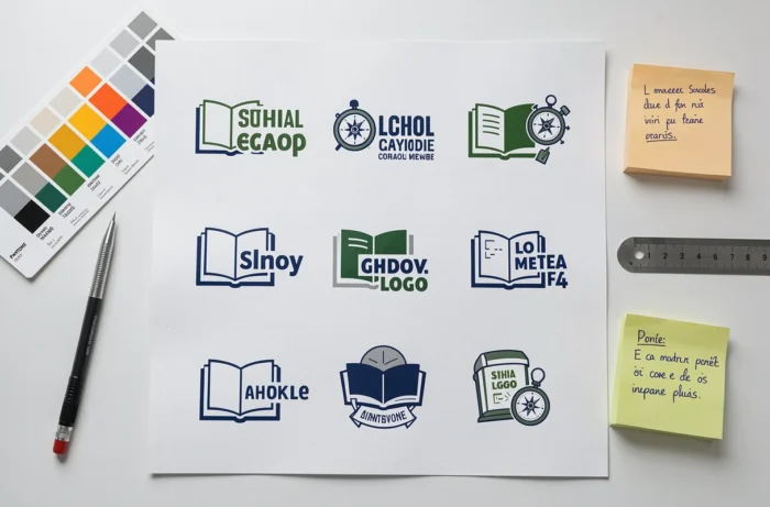
Adapting a school logo for digital and print materials
A logo doesn’t exist in isolation. It needs to work across an ecosystem of materials: the website, mobile app, letterhead, entrance sign and clothing. Planning a horizontal version, a vertical version and an icon-only version from the outset ensures this versatility.
The vector file (SVG or AI format) is an essential technical foundation. It lets you resize the logo without losing quality, from a 16-pixel favicon to a sign several meters wide. Bitmap formats (PNG, JPEG) are useful for everyday applications, but shouldn’t be the only files provided.
- For the web, export the logo as an SVG and include descriptive alternative text in the HTML tag. This improves both SEO and the accessibility of the school website.
- For print, provide a CMYK version with Pantone references for each color to avoid color variations across materials.
- For embroidery and screen printing, simplify the logo by reducing the number of colors and thickening fine lines, which can disappear on fabric.
Visual consistency across all these materials is what builds recognition and trust among families over time. A well-designed logo that is poorly adapted loses some of its impact.
The final point to keep in mind is longevity. A school logo shouldn’t need to change every three years. Choosing timeless shapes over fleeting graphic trends protects the initial investment and avoids having to rebuild visual recognition among families with every redesign.